Monday, 27 February 2012
TOP OF THE POPS CONTENTS CONVENTIONS.
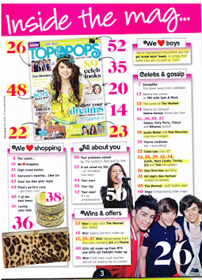
This was the only example of 'Top of the Pops' contents page that I could find on the internet. Even though this is just one style model, I can still draw plenty of conventional features and techniques that the designers have used.
First of all there is a text box at the top of the page which displays the masthead for the contents. At the end of this is an ellipsis which creates feelings that there is plenty more information to be found out within the magazine.
Alongside this there are plenty of other text boxes which show snippets of information on what you will find in the magazine with large page numbers printed in front of them.
For each text box there is different categories of text such as 'Wins & offers' and 'Celebs & gossip' showing that there is plenty of information in the magazine.
As well as this the subheadings are placed in text boxes at the top of 'their' content, and printed in a curly font; this is suitable as the target marget is for young girls - they tend to like this style of font as it represents 'girliness'
Mid shots have also been used to show the artists which feature in the magazine - these have a large page number printed on the picture to inform the readers what page they can be found on.
A page number is also displayed at the bottom of the page, but centered so it is visible and people know what page the magazine begins on. For this it has used the teachnique of 'WOB' (white on black) so it stands out from the rest of the text and so it doesn't clash with the rest of the colours on the page.
A copy of the front cover is also on contents page in the top left hand corner. With this page numbers are surrounding it of the pages where you can find the front cover content. These are made visible by being made bigger and arrows pointing to where the information indicating the page they are located on.
Subscribe to:
Post Comments (Atom)

No comments:
Post a Comment