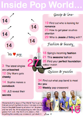
I have only edited the love heart into this onto the 'We <3 Pop'.
I still need to add in the front cover into the blank area and change the page numbers surrounding it.
Double Page Spread:
 This is my first updated double page spread. As you can see I changed the colour of the background to a lighter pink so it looks similar to my contents page. I also feel that this colour pink is much more softer and creates more of a girly, laid back feel to the magazine.
 There are still some changes that need to be made such as the '<3' love heart in the text box so is gives the text an informal chatty tone and register. It would also then stick to conventional ideas as love hearts are included in my style models.
As I extracted the main text box from the old double page spread I could not change any of the text and make them into separate text boxes.
 I changed the quoted title so it is extracted from the text so it looks more conventional and in order for it to look neat and professional. I re-done the text boxes so that I could separate them to make it look more similar to a magazine and so you can see a little bit more of the background picture. With the main background mid shot I moved it over to the left so more of the images face is visible and so more of the page is dominated. I also included a burst in the middle of the text boxes to match my style model and to give it more of a magazine style - even though it is not very detailed it still supplied the readers with a little quote of what has been said in the text.
 I have noticed that I have cut a little bit of information off at the bottom of the first text box so I will need to adjust that.

No comments:
Post a Comment