Front Cover:
This is another front cover I produced during the process of the main task. I done some experimenting with this cover as I created it on Microsoft Publisher.
I found it very easy to organise the things I wanted and found that it was easier to add and move pictures around once on it than using the macs.
Even though the cover looks relatively busy I don't think I have developed the conventions to the best that I could. I also think the balance and size of pictures/text/text boxes are all out of propotion making it look messy and cluttered.
Besides this I don't think that the image fits the cover well and makes the model look squashed into the middle while all the text is over powering it. Some of the areas I like about it are pastel colours I used as I think they make the page look more girly and aimed towards this target audience. I think they a subtle which makes the magazine seem more laid back and relaxed which could reflect on to the readers attitude and behaviour towards it. When reading a magazine you don't want to seem on edge or feel out of place - discomfort.
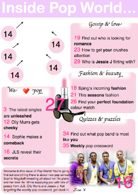
Contents Page:
As you can see again I have maintained the same colours and fonts however I have added an editors note on the bottom of the page to break conventional ideas ( Top of the Pops magazine doesn't normally have an editors note). I have decided to include one of these as I feel that it gives the magazine a bit of a more subtle and friendly side as the editor is connecting and talking to the readers. This can engage the readers into the content of the magazine.
Also I still haven't completed this as I need to put the final front cover in between the page numbers with arrows. I am waiting till the end product is complete to add it in as I am certain that this conventional feature will be included.
Other conventional features that I have used is the enlarged page numbers over the pictures so readers are aware what page they can find them on.
Individual text boxes supplying information of each section which is also what my Top of the Pops style model has. A swirly font has been used in the subheading text boxes which also is a conventional feature. I don't really like the 'Chancery' font I have used for this but it is the only font on the Mac with is closed to a swirly font.
I have also used an ellipsis at the end of the contents masthead which is what my style model used. This gives the effect that there is more information to know and to entice the readers to carrying on and reading the rest of the magazine.
I have made all page numbers bigger on the page to make them clear and easy to read and so people don't get confused between the page number and the text.
Double Page Spread:
This is my second double page spread draft. I decided to completely change the style, colours, picture and layout as it wasn't similar to my style models. I feel that this is more recognizable as a pop magazine double page spread however there's still things I would like to change on this. I think I will have to change the colours to a lighter shade of pink so it looks more symmetrical to the magazine contents page.
Conventional features which I have included on this is a quote from what the artist has said in their interview as my style models do the same. I have also placed the billboard information in a 'burst' style circle which entices the readers to read that first and to of course... draw attention!
I have also included a burst of 'win' to heightened the chances of readers being interested in what's being said and to give them the chance to get more involved with the magazine.
Page numbers also play an important feature in magazine as it allows the readers to know what page they are reading from and so they can find the page what they want to read. The only negative about this is that I would rather have WOB so the page number is in white and the background is in black. This would make the double page spread look more conventional and include media terminology.


No comments:
Post a Comment