Friday, 20 April 2012

EVALUATION 7: PROGRESSION.


View more presentations from zoerichardson

                                                  APPLYING THIS TO THEORY.

Obviously before creating my preliminary task, I hadn't been taught a lot of theory information which I think affected the quality of it. Throughout the course of the project I have learnt how to apply this   theory to the genre of pop and it has helped me achieve my final product. 

Four Fs.

When it came to making my end product, I took all of the different categories (format, function, frames, formula) into consideration to make my product look professional. 

I made sure that the format of the magazine was bright and cheerful so when people thought about it, it would portray happy and joyful thoughts. I also wanted it look look appealing to my target audience, therefore I made it look girly by adding swirly fonts and adding love heart symbols where appropriate. 

I made sure that when it came to my magazine it had a certain purpose, otherwise known as the function. I wanted to make sure it had this as I feel it would be more meaningful and would gain more interest. I maintained this by structuring the work so the readers could easily find the same features in the magazine each week. I've included a real life story which will be included in every issue. The function of my magazine was that it supplied readers with all the latest news about my featured pop artists. 
I made sure that the frames of my magazine were kept equal throughout for it to look neat and stylish. This included lining up all text in the same place for it to look equal and 'stylish' and so it doesn't look untidy. 
When it comes to the formula I made sure that I included many conventional features so that I could continue to use them in upcoming issues in order from them to look similar. Another part of this would have to be the colours and fonts. I think it would be useful to stick to the same ones in other issues for it to show continuity. All of these features had a set placed in order for them to look right and to prevent the magazine from looking untidy. 

Obviously as we hadn't been taught this before the preliminary task was set, I couldn't incorporate the features into it.


During the process of the main task I also learnt that I'm now a gate keeper. 
"A gatekeeper is a person who controls access to something"
                                                        -Wikipedia
As I designed all of the content in my magazine, i have limited the information on what my readers find out about; this allows me have power and control over my audience. 


As I have said in the presentation above, I have learnt a lot of terminology and theories. One key theory which helped me a lot was ideologies. the basis of ideology states that everything generates different thoughts and overtime is becomes a set idea or belief. I took this into account through the creation of my main task as I carried out secondary research in order to get clear ideas on what people associate pop music with. I found that people find pop lyrics are mainly to do with love and relationships and generally create a positive vibe. I incorporated all this information into my magazine so readers could clearly identify that it was to do with pop.
The ways in which I included this in my magazine and therefore represents ideologies is by creating several sell lines based on love, crushes, secrets and relationships. This is reinforced by a 'Love Special' teaser which informs readers that the topic of love is featured inside. 
Ways in which I heightened the positive vibes is by using bright bold colours throughout. 

Thursday, 19 April 2012

EVALUATION 6: TECHNOLOGY.


What have you learnt about technologies from the process of constructing your product?
Throughout this whole process I have learnt not to rely on technology! Below are some of the problems  that I faced...

Macs
The problem when using the Mac was that they was very time consuming seeing as I had never used one before and had to learn how to work it, especially how to construct front covers, contents, and double page spreads on Pages. I took several attemtps creating drafts as I was still getting used to how to work it, and discovering new techniques that I could incoorperate in on my work. I also had to ask for help on several things, such as how to find software and even how to use the software, such as 'grab'. I had to use this as I had to convert my Pages document into a picture file in order to upload it to my blog.I had to do this with each of my documents or otherwise they wouldn't be on my blog!

Latops
One of the main problems that I experienced was that when starting my work on Mac Pages, I then couldn't open it on a normal laptop as it didn't support the Pages software. This obviously was a big problem as I couldn't work on my magazine pages in my own time as I couldn't get access to a Mac. This delayed the amount of time I had for creating the front cover, contents as double page spread as I could only continue to create them in school time. Alongside this I didnt have Mircosoft Publisher on my  own laptop, which alos prevented me from creating the magazine pieces at home.

Cameras
Using the cameras bought many problems. Firstly, when I was taking the final images, with the Nikon camera it started running out of battery and need to be charged, meaning we had to rush taking the photos. I think this affected the overall quality and 'look' of the photo as they weren't how I wanted them. This meant I had to arrange another date for taking pictures so the camera could charge and be ready.
Secondly, when I was taking the recce photos with the school's camera it had a cracked screen meaning I couldn't see what the pictures turned out like and it soon rang out of batteries meaning I could no longer use it. I couldn't even take it back and get another one as the rest were either in use, didn't turn on or had no battery. To overcome this I used the camera on my phone to take the recce pictures then sent them to my email to then upload onto the computer. However putting aside these problems, the Nikon camera did produce good quality pictures and I finally got the end result which met standards.


1001 fonts
Even though there were several fonts on this website that I could of used and represented the 'pop' feel I ended up not using them as when I copied and pasted it into Pages, it came with a white background and didn't fit in correctly with the rest of the context. It also didn't let me change the colour which also posed as another problem.

Pages/IPhoto
As I previously said I didn't know how to work Pages or IPhoto, so it took a bit of time working these and figuring out how to use them. In the end I didn't use IPhoto because it was too confusing and Piknik was a better solution to use as it had more features and generally was easier to use.

Serif Draw Plus
This is the software I used to remove the background behind my model in order for it to be clear. At first this I didn't know how to do it however once my teacher shown me, I got the hang of it. As you can see the pictures aren't perfectly cut out however I done it as best as I could and tried to cover up the jaggered edges with text.

Desktop Publisher
I created one draft of the front cover on this to experiment and see whether it produced a better standard of quailty than Pages. I found that I could get the work done much more quickly and I found it easier to contruct as I have worked on publisher many times before. The only problem with this is that I don't have a clue how to upload it to the blog so I will need to do some more research on how to upload it.

Slideshare
I had plenty of troubles when it came to using this! As I had never used this before I was unaware of how it works and how to use it. I then asked a friend and they said you had to create the document on Mircosoft Word or Powerpoint first and then upload it - so that is what I did. However it took me several attempts to upload as it kept on saying 'error'. I worked out that this was because I still had the document open on my desktop. So once it uploaded I then figured out the the fonts I used where too big and made the text 'hang' off the page, so I had to delete that presentation and change the fonts and size on the document... then upload it again! Once this was done I had troubles on how to upload it onto my blog. I 'Googled' and even 'Youtubed' how to do this and it soon gave me the correct way. I embedded it into my blog and realised it had to go in the 'HTML' tab. It was as easy as that.

Apart from these problems I felt that working with technology. was the best option to use as it made me get my work done more quickly and efficiently while making it at a better standard. 

Wednesday, 18 April 2012

EVALUATION 5: ATTRACTING MY AUDIENCE.


Tuesday, 17 April 2012

EVALUATION 4: TARGET AUDIENCE.

Who would be the audience for you media product?


I have created my magazine to interest teenagers, preferably young girls aged between 12 to 17.


I have chose to aim my product at this age range as I feel that they are more interested in purchasing and reading about pop music and the gossip to go with it. This idea is enhanced as now we have artists such as Justin Bieber, One Direction and JLS in the limelight and these are the bands that teenage girls love! Most young girls are obsessed with these pop artists meaning they are likely to be more interested in reading about them if they were on the cover of a magazine. 


In the presentation below I am going to discuss my audience for my magazine product and how I've gone about this. 


In contrast to this people who would not be a fan of this kind of music and genre of magazine is those who favour heavy metal and rock music. Magazines such as Kerrang! and NME would be more appropriate for them.

Monday, 16 April 2012

EVALUATION 3: MEDIA INSTITUTE.


Sunday, 15 April 2012

EVALUATION 2: SOCIAL GROUPS.

How does your media product represent particular social groups?

Within my style model of 'Top of the Pops' there is a consistent feature of fashion that appears in each magazine. This visibly categorizes the magazine in to a girls favour. Boy would not be interested in girls clothes. By this, it could categorize girls into caring about this aspect - the way they look.

The kind of content involved in the magazine also makes it clear that the magazine is aimed towards young girls who are fans of pop music and artists. The style model issues always print information about male celeb secrets or love gossip - it would be rare to find a boy wanting to read about these kind of things!

My media product could represent social groups as being  keen on finding out celeb gossip and maybe stereotype them into the 'girly' kind of person who likes beauty, fashion and advice.


Saturday, 14 April 2012

EVALUATION 1: CONVENTIONS.

Evaluation 1
View more presentations from zoerichardson

I mainly stuck to reinforcing the original conventions of a magazine in order for my magazine to be successful and gain a lot of interest from my target audience. If previous conventions of Top of the Pops attracted the similar age range to mine about became a great hit, then surely mine would! 
I thought that by sticking to conventions then it would make my magazine look more realistic and allows the readers to have clear insights on the genre that it is. Also by following conventions I instantly knew that the final outcome of my product would look similar to a pop magazine - meaning that I didn't have to worry about altering it at the end of the process to make it look like my chosen genre.

Tuesday, 10 April 2012

FINAL MAGAZINE PIECES.

Front Cover:


This is my final magazine front cover. As you can see I have included a varitey of conventional features that make my cover look more like a pop magazine and appealing to my readers. In some of the presentationsI have commented on the different conventional features that I included and some areas of the pieces that I challenged. During the process of creating and designing it, I thought a lot about the theories and different research methods I could include in order for it to be more suitable for my target audience.

When it came to thinking about the design philosphy I spilt my magazine in sections on what areas I want it to represent.
The main categories I want it to represent is it being a 'modern' magazine rather than retro. I have portrayed this idea is by including several modern, up to date artists which the younger generation (my target audience) will be familiar with.
Similarly to this I have represented my magazine as being 'now' rather than timeless as I feel that the older generation have had they era of pop music and aren't really a fan of the loud, fast music that it brings. For this reason I have chosen 'now' as my target audience are more like to listen, buy and read about pop music meaning my magazine would get more sales.
I have decided to make my magazine have 'consistancy' throughout and to show signs if continuity for it to look professional and well designed demonstrating it has good quailty. The ways in which I have represented this idea is by using similar colours through the contents, contents and double page spread as well as similar sans serif fonts and maintained the correct level of formality and use of language during the three pieces.
As you can see from looking at my cover I have chosen to design a 'cluttered' layout as it is busy and creates a lot of attention. The way I've constructed my cover to look cluttered is by involving several sell lines, teasers and hooks. The use of bright, bold colours also makes it look more forward and alerting.
I've made all three coursework pieces 'conventional' rather than making it original. If I decided to make it original, it could have been risky as I would be uncertain if people like it and it would even turn out looking like a pop magazine. The main conventional features I've used on the cover is the bold masthead, several sell lines and the mid shot, studio image.
I have also stuck to the idea of making the cover look 'balanced'; this signifies how equal and in proportion everything is. I supported this by making the text, text boxes and picture all to a similar size, not allowing one certain feature dominate the page apart from the masthead and mid shot of the main artist.


Contents Page:


Double Page Spread:

THIRD DRAFTS.

Contents Page:


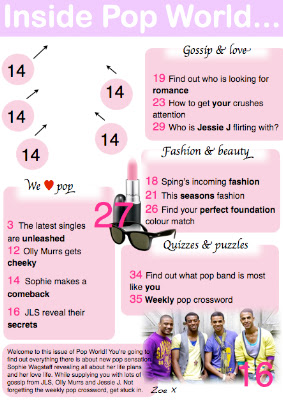
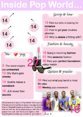
I have only edited the love heart into this onto the 'We <3 Pop'.
I still need to add in the front cover into the blank area and change the page numbers surrounding it.


Double Page Spread:
This is my first updated double page spread. As you can see I changed the colour of the background to a lighter pink so it looks similar to my contents page. I also feel that this colour pink is much more softer and creates more of a girly, laid back feel to the magazine. 
I have also changed my page numbers so they are white on black (WOB) in order to make them stand out more from the text and to stick to conventional ideas. 
There are still some changes that need to be made such as the '<3' love heart in the text box so is gives the text an informal chatty tone and register. It would also then stick to conventional ideas as love hearts are included in my style models. 
As I extracted the main text box from the old double page spread I could not change any of the text and make them into separate text boxes. 


I changed the quoted title so it is extracted from the text so it looks more conventional and in order for it to look neat and professional. I re-done the text boxes so that I could separate them to make it look more similar to a magazine and so you can see a little bit more of the background picture. With the main background mid shot I moved it over to the left so more of the images face is visible and so more of the page is dominated. I also included a burst in the middle of the text boxes to match my style model and to give it more of a magazine style - even though it is not very detailed it still supplied the readers with a  little quote of what has been said in the text.  
I have noticed that I have cut a little bit of information off at the bottom of the first text box so I will need to adjust that. 


As you can see I have now made the text box bigger so the rest of the text is now on display. I have also added in the red love heart!

Monday, 26 March 2012

SECOND DRAFTS.

Front Cover:
This is another front cover I produced during the process of the main task. I done some experimenting with this cover as I created it on Microsoft Publisher.
I found it very easy to organise the things I wanted and found that it was easier to add and move pictures around once on it than using the macs.
Even though the cover looks relatively busy I don't think I have developed the conventions to the best that I could. I also think the balance and size of pictures/text/text boxes are all out of propotion making it look messy and cluttered.
Besides this I don't think that the image fits the cover well and makes the model look squashed into the middle while all the text is over powering it. Some of the areas I like about it are pastel colours I used as I think they make the page look more girly and aimed towards this target audience. I think they a subtle which makes the magazine seem more laid back and relaxed which could reflect on to the readers attitude and behaviour towards it. When reading a magazine you don't want to seem on edge or feel out of place - discomfort.


Contents Page: 

As you can see again I have maintained the same colours and fonts however I have added an editors note on the bottom of the page to break conventional ideas ( Top of the Pops magazine doesn't normally have an editors note). I have decided to include one of these as I feel that it gives the magazine  a bit of a more subtle and friendly side as the editor is connecting and talking to the readers. This can engage the readers into the content of the magazine.
Also I still haven't completed this as I need to put the final front cover in between the page numbers with arrows. I am waiting till the end product is complete to add it in as I am certain that this conventional feature will be included. 
Other conventional features that I have used is the enlarged page numbers over the pictures so readers are aware what page they can find them on.
Individual text boxes supplying information of each section which is also what my Top of the Pops style model has. A swirly font has been used in the subheading text boxes which also is a conventional feature. I don't really like the 'Chancery' font I have used for this but it is the only font on the Mac with is closed to a swirly font. 
I have also used an ellipsis at the end of the contents masthead which is what my style model used. This  gives the effect that there is more information to know and to entice the readers to carrying on and reading the rest of the magazine.  
I have made all page numbers bigger on the page to make them clear and easy to read and so people don't get confused between the page number and the text. 

Double Page Spread:


This is my second double page spread draft. I decided to completely change the style, colours, picture and layout as it wasn't similar to my style models. I feel that this is more recognizable as a pop magazine double page spread however there's still things I would like to change on this. I think I will have to change the colours to a lighter shade of pink so it looks more symmetrical to the magazine contents page. 
Conventional features which I have included on this is a quote from what the artist has said in their interview as my style models do the same. I have also placed the billboard information in a 'burst' style circle which entices the readers to read that first and to of course... draw attention!
I have also included a burst of 'win' to heightened the chances of readers being interested in what's being said and to give them the chance to get more involved with the magazine. 
Page numbers also play an important feature in magazine as it allows the readers to know what page they are reading from and so they can find the page what they want to read. The only negative about this is that I would rather have WOB so the page number is in white and the background is in black. This would make the double page spread look more conventional and include media terminology. 

Sunday, 25 March 2012

FIRST DRAFTS.


Front Cover:


This is my first attempt of creating a music magazine front cover. From looking at it I am very unhappy on the way it looks as it noway looks similar to a pop magazine cover. To help improve my knowledge of what a pop magazine cover should look like I researched Top of the Pops front covers and annotated them so I could pick of the conventional features and apply them to my own covers.
The conventional features on this cover is the main mid shot image centered in the middle, giving the readers direct eye contact making it magazine feel more personal and targeted to the reader.


Contents page: 

As you can see this is contents page is incomplete - I need to add in the copy of the front cover between the page numbers and arrows. I haven't added it in yet as I am going to wait until I have produced my final one. 


Double Page Spread:


This is my first copy of my double page spread. As you can see it is very basic and it doesn't look very conventional. I chose to make the image take up a whole page as from looking at other style models, that what they done. There are a lot of things I want to change about this as I feel that it doesn't have enough substance.


Wednesday, 21 March 2012

RISK ASSESSMENT.

Obviously for our magazine, we had to take our own photos. It's important that I assess all the dangers that could occur and put them right to prevent them from happening. This process just enhances the health and safety of the model as we don't want any accidents.
As I wanted a white background in my images the stage was the most appropiate place for taking them as there is a white back drop at the back. This is placed in the school hall where assemblies are often held and where students eat at lunch and break seeing as the canteen is also in the same room. Another benefit of taking my picture on the stage is that there are the two options of lighting - artifical and natural. Surrounding the stage are several lighting lamps shinging the light directly on the stage - they also had blue, red, and green lights. There are also windows in the hall which provided the natural light, so I could easily see which kind of lighting worked best for the final product.
There was little chance of anything major happening, however below is some of the things that could have happened if we was not careful. 

RISK: as the floor of the stage is vanished it makes it very slippery if wearing inappropiate shoes/socks. If you are just wearing socks on the stage, there is chance that you would slip and fall over, which may result in someone hurting themself.
SOLUTION: in order to prevent this from happening the people/model present o n the stage would need to wear shoes with a rubber grip or take shoes and socks off in benefit of their safety.

RISK: as there are several switches and leads in order to turn on/off the artifical lights, there are chances that the leads and extensions being left of the floor which someone could trip over and injure themselves. 
SOLUTION: to prevent this from happening, I need to maake sure that all leads and wires are tucked away before taking the pictures

RISK: as there are no heaters that currently are turned on in the hall, it is very cold. Seeing as my model will be in a skirt/shorts and a crop top, she may get cold.
SOLUTION: to make sure she stays at the right body temperature it is important that I take some warm clothing with me which she could wear in case we are in there for a long time and to stop her getting cold. This could simply be coats, scarfs, hats, tracksuit bottems etc.

RISK: seeing as there is a control pannel for working the artifical lights, it's important that I get taught how to work it correctly to stop any troubles from happening. This may include turning the right lights on and preventing electrocution.
SOLUTION: to stop getting electrocuted, there must be no liquids near the switches and dry hands is a must before working them.

Tuesday, 20 March 2012

MY DESIGN PHILOSOPHY.

From over viewing several magazines and images of their front covers, contents page and double page spread, I have clear thoughts on what I do and don't like when thinking about the design.

Retro vs Modern
In oder to fit in with the style and genre of my magazine, I would have to choose modern. I think making a retro magazine with pop content would look a bit silly - I would only to this if I was targeting my magazine at the older generation so that it appeals to them more. I think by using the modern style would adds more excitement to the magazine, making it look less dull and a bit more entertaining than other magazines. The modern style would probably feature bright colours - maybe pastel ones as they are more favorable than dull, boring ones. The use of these colours would make the magazine more 'fun'. As well as this I would chose sans serif font over serif as again this is aimed at more of the new, young generation with a more modern appeal. The serif font would be more suitable for the older generation as a majority of them seem to like the old original things and don't necessarily like change.


Timeless vs Now
The idea of this kind of ties in with the same ideas as above. I would chose the 'now' style other the 'timeless' seeing as fashions, trends, and opinions are all changing over time and people are less likely to choose something date than something that is new. Again this is purely based on my target audience as if I wasn't aiming it a young teenage girls then I would more likely base my magazine on a timeless style so it appeals to the correct audience. 


Consistency vs Inconsistency
I think it's important that the magazine remains consistent throughout as it makes it look neat and tidy and so that people know what to expect throughout the magazine. This could include things such as the layout and design, the colours, fonts, size of pictures etc. If it wasn't consistent then people may be less interested in it as it doesn't professional and creates ideas that the designer doesn't understand how to make something look good and all in proportion. 


Minimal vs Cluttered
I like the idea of magazine having a minimal layout however displaying a lot of content. However because I am following conventional ideas from Top of the Pops magazine they are quite cluttered and a lot of information is displayed on the covers, therefore I will have to copy this convention and make sure there are several sell lines, bursts, tag lines etc on the cover. 


Conventional vs Original
In order to make my magazine look similar to real ones I think it is a wise idea to copy conventional features. This allows readers to know what to expect and to make sure that the features I decide to use will fit in with the readers expectations and hopefully leave them wanting to purchase the magazine. 


Balance
Balance kind of fits in with the consistency of the magazine. If the size of fonts, pictures, and text was not equal or similar to other features on the magazine, it would leave the magazine with a poor design. Personally I think this is one of the most important features seeing as it is one of the main determiners on how the layout and design looks. 
When creating my magazine I have tried to make sure that everything is in proportion when comes to the text, pictures etc to make the magazine look nice and neat. 

THE FOUR F's.

When creating a magazine you have to put these four Fs into consideration as they can help you achieve your end product.

FORMAT
This is the way in which the magazine is designed and put across to the target audience. The way it looks is very important and has to follow conventional features in order to fit in with that particular genre and so it still appeals to the people it is aimed at. The kind of things that come under format are the fonts, colours,  pictures, and the general design of the layout. 
I have decided to stick to conventional ideas of choosing bright bold colours so it stands out from other magazines and so people are easily attracted to it. I have chosen a modern font seeing as the majority of pop music is 'funky' and up to date

FRAMES
Even though this doesn't seem the most important feature in magazines however margins and gutters are something that needs a lot of attention being paid to. This is because if they differ from page to page they can make the text an layout look untidy and messy. To remain the professional look, it would be wise to make them all the same size throughout the magazine and to keep them clear.

FUNCTION
This is based on the purpose of the magazine and what it is for. This is something that needs to be clear to the audience to prevent confusion and to maintain the target audiences' attention.
I have produced and based my magazine based on pop music - therefore making it easier to design the layout and think about what content to involve. As I'm doing my magazine on pop music, it wouldn't be necessary to talk about any other genre in it as then it would probably attract a different audience; this is not what I want.
A prime example of this can be the music magazine of 'Kerrang!'. This magazine is all about heavy rock and metal music. As it is focused on this genre, it helps gives the magazine an overall purpose and helps to base the magazine of an overall topic; this will also make it easier to target a specific audience - which also supplies more ideas of a suitable layout, design and content ideas.

FORMULA
This is the way in which the magazine is designed when it comes to the articles and features. It's a crucial feature that has to be maintained the same each month considering people normally favour one part of the magazine most compared to the others. If you were to change any section of the magazine after a period of time, you could lose interest and regular costumers so it is not worth the risk. The overall idea of this is that it the magazine maintains the same look throughout its time with little change of the design occurring. 

Monday, 19 March 2012

USES AND GRATIFICATIONS.

Media Theories
  • hypodermic needle- the media supplies the passive audience with a message in which they are powerless to resist (discredited)
  • drip, drip, drip effect, cultivation effect- the repetition of messages does have some affect on the audience. for example, reporting of a crime heightens our fear of crime (the cultivation differential)
  • two-step flow- the media introduces us two ideas (step one), we discuss these ideas with others and reach an opinion (step two)
  • limited effect- the media doesn't affect us much as we are media literate, and sophisticated readers of text
  • media dependency- the belief that we come to need the media (is this an addiction or choice?)
Uses and Gratifications - this theory is about "what people do with media" rather than "what media does to people" (Katz, 1959). It assumes that members of the audience are not passive but take an active role in interpretting and integrating media into their own lives. The theory also holds that audiences are responsible for choosing media to meet their needs. The approach suggests that people use the media to fulfil specific gratifcations.

Blumler and Brown (1972) Four Primary Factors for which one amy use the media for:
  • diversion-something to do, escape from reality/problems
  • personal relationships-using media to discuss with friends afterwards, media as a subsitute for 'real contact'. Does it fit in with "two step flow"?
  • personal identity or individual psychology-defining yourself by your media texts. Building your sense of self
  • surveillance-finding out about the world, finding out information.

A man who has the name of 'McQuail' classified several reasons for media use in 1983. Some of these are listed below.

Information
  • finding out about relevant events and conditions in immediate surroundings, society and the world
  • seeking advice on practical matter or opinion and decision choices
  • satisfying curiosity and general interest
  • learning; self education
  • gaining a sense of secruity through knowledge
Personal Identity
  • finding reinforcement for personal values
  • finding models of behaviour
  • identifying with valued others (in the media)
  • gaining insight into oneself
Integration and Social Interaction
  • gaining insight into the circumstances of others; social empathy
  • identifying with others and gaining a sense of belonging
  • finding a basis for conversation and social interaction
  • having a subsituate for real life companionship
  • helping to carry out social roles
  • enabling one to connect with family, friends and society
Entertainment
  • escaping, or being diverted from problems
  • relaxing
  • getting intrinsic cultural or aesthetic enjoyment
  • filling time
  • emotional release
  • erotic/sexual arousal
                                                                                                                        

This is relevant as music magazines follow similar rules.


Following Blumler and Browns ideas about the 4 primary factors you can see how they are applied to music magazines. 
-Diversion is definitely present as reading magazines allows people to have their own private, relaxing time while also providing them with information about what they take interest in. if someone is a fan of pop music, then buying a pop magazine would be ideal for them as they are finding out the latest gossip to do with pop music. 
-Personal relationships also plays a factor when it comes to magazines as people feel as if they can connect to what is being said and makes them feel part of the context as they are getting an insight of what is happening in the featured artists life. This idea is supported as it also allows them to then carry out a conversation about it to their friends or family about the news they have read in the magazine. This could be considered as word of mouth as the person receiving the information may then go out to buy it to find out more information - making the magazine gain a bigger audience while enhancing their reputation. 
-Personal identity can be considered in this process as the news and gossip supplied in the magazines can help a person develop themselves in areas such as fashion, beauty or makeup. The text may influence the readers to try out different things and to experiment with new things.
-Surveillance is clearly present when it comes to magazines as the reader is constantly finding out new gossip and news about celebrities and the kind of life style they lead. Information can be found out about which the readers may not even knew about and could gain a different insight of things from this. 


McQuails reasons for media use seem to be very different but in a way true. The main categories are information, personal identity, integration and social attraction and entertainment.
Within the information category it focuses on things that you can acknowledge and learn and how you see yourself - self actualisation. Magazines  supply the readers with news and information that they never knew and create responses to it which is appropiate. The information can be took in many different ways and it depends on the kind of person you are on how to react to it. For example an artist may be pregnant and some readers will be pleased and delighted whereas others may find it silly and career ruining.
Personal Identity kind of links into the information criteria as it pays a lot of attention to youself and other people. It could be considered that the way some artists come across in magazines may interest the readers who may then take inspiration and start acting in a similar way.
Integration and social interaction is based around the society. How things influence one another and how people behaviour and respond to interactions. This could be similar 'information' as a particular article could gain a different reaction to someone else. 
Entertainment provides suggestions on relaxation and emotional release which could suggest that people get a sense of pleasure and enjoyment out of reading magazines. It could be seen that magazines portray erotic and sexual arousal through the use of pictures and content. If someone is attractive on the frint cover it could be seen as a greater purpose of purchasing the magazine.