Wednesday, 18 April 2012

EVALUATION 5: ATTRACTING MY AUDIENCE.


Tuesday, 17 April 2012

EVALUATION 4: TARGET AUDIENCE.

Who would be the audience for you media product?


I have created my magazine to interest teenagers, preferably young girls aged between 12 to 17.


I have chose to aim my product at this age range as I feel that they are more interested in purchasing and reading about pop music and the gossip to go with it. This idea is enhanced as now we have artists such as Justin Bieber, One Direction and JLS in the limelight and these are the bands that teenage girls love! Most young girls are obsessed with these pop artists meaning they are likely to be more interested in reading about them if they were on the cover of a magazine. 


In the presentation below I am going to discuss my audience for my magazine product and how I've gone about this. 


In contrast to this people who would not be a fan of this kind of music and genre of magazine is those who favour heavy metal and rock music. Magazines such as Kerrang! and NME would be more appropriate for them.

Monday, 16 April 2012

EVALUATION 3: MEDIA INSTITUTE.


Sunday, 15 April 2012

EVALUATION 2: SOCIAL GROUPS.

How does your media product represent particular social groups?

Within my style model of 'Top of the Pops' there is a consistent feature of fashion that appears in each magazine. This visibly categorizes the magazine in to a girls favour. Boy would not be interested in girls clothes. By this, it could categorize girls into caring about this aspect - the way they look.

The kind of content involved in the magazine also makes it clear that the magazine is aimed towards young girls who are fans of pop music and artists. The style model issues always print information about male celeb secrets or love gossip - it would be rare to find a boy wanting to read about these kind of things!

My media product could represent social groups as being  keen on finding out celeb gossip and maybe stereotype them into the 'girly' kind of person who likes beauty, fashion and advice.


Saturday, 14 April 2012

EVALUATION 1: CONVENTIONS.

Evaluation 1
View more presentations from zoerichardson

I mainly stuck to reinforcing the original conventions of a magazine in order for my magazine to be successful and gain a lot of interest from my target audience. If previous conventions of Top of the Pops attracted the similar age range to mine about became a great hit, then surely mine would! 
I thought that by sticking to conventions then it would make my magazine look more realistic and allows the readers to have clear insights on the genre that it is. Also by following conventions I instantly knew that the final outcome of my product would look similar to a pop magazine - meaning that I didn't have to worry about altering it at the end of the process to make it look like my chosen genre.

Tuesday, 10 April 2012

FINAL MAGAZINE PIECES.

Front Cover:


This is my final magazine front cover. As you can see I have included a varitey of conventional features that make my cover look more like a pop magazine and appealing to my readers. In some of the presentationsI have commented on the different conventional features that I included and some areas of the pieces that I challenged. During the process of creating and designing it, I thought a lot about the theories and different research methods I could include in order for it to be more suitable for my target audience.

When it came to thinking about the design philosphy I spilt my magazine in sections on what areas I want it to represent.
The main categories I want it to represent is it being a 'modern' magazine rather than retro. I have portrayed this idea is by including several modern, up to date artists which the younger generation (my target audience) will be familiar with.
Similarly to this I have represented my magazine as being 'now' rather than timeless as I feel that the older generation have had they era of pop music and aren't really a fan of the loud, fast music that it brings. For this reason I have chosen 'now' as my target audience are more like to listen, buy and read about pop music meaning my magazine would get more sales.
I have decided to make my magazine have 'consistancy' throughout and to show signs if continuity for it to look professional and well designed demonstrating it has good quailty. The ways in which I have represented this idea is by using similar colours through the contents, contents and double page spread as well as similar sans serif fonts and maintained the correct level of formality and use of language during the three pieces.
As you can see from looking at my cover I have chosen to design a 'cluttered' layout as it is busy and creates a lot of attention. The way I've constructed my cover to look cluttered is by involving several sell lines, teasers and hooks. The use of bright, bold colours also makes it look more forward and alerting.
I've made all three coursework pieces 'conventional' rather than making it original. If I decided to make it original, it could have been risky as I would be uncertain if people like it and it would even turn out looking like a pop magazine. The main conventional features I've used on the cover is the bold masthead, several sell lines and the mid shot, studio image.
I have also stuck to the idea of making the cover look 'balanced'; this signifies how equal and in proportion everything is. I supported this by making the text, text boxes and picture all to a similar size, not allowing one certain feature dominate the page apart from the masthead and mid shot of the main artist.


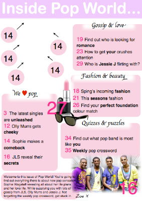
Contents Page:


Double Page Spread:

THIRD DRAFTS.

Contents Page:


I have only edited the love heart into this onto the 'We <3 Pop'.
I still need to add in the front cover into the blank area and change the page numbers surrounding it.


Double Page Spread:
This is my first updated double page spread. As you can see I changed the colour of the background to a lighter pink so it looks similar to my contents page. I also feel that this colour pink is much more softer and creates more of a girly, laid back feel to the magazine. 
I have also changed my page numbers so they are white on black (WOB) in order to make them stand out more from the text and to stick to conventional ideas. 
There are still some changes that need to be made such as the '<3' love heart in the text box so is gives the text an informal chatty tone and register. It would also then stick to conventional ideas as love hearts are included in my style models. 
As I extracted the main text box from the old double page spread I could not change any of the text and make them into separate text boxes. 


I changed the quoted title so it is extracted from the text so it looks more conventional and in order for it to look neat and professional. I re-done the text boxes so that I could separate them to make it look more similar to a magazine and so you can see a little bit more of the background picture. With the main background mid shot I moved it over to the left so more of the images face is visible and so more of the page is dominated. I also included a burst in the middle of the text boxes to match my style model and to give it more of a magazine style - even though it is not very detailed it still supplied the readers with a  little quote of what has been said in the text.  
I have noticed that I have cut a little bit of information off at the bottom of the first text box so I will need to adjust that. 


As you can see I have now made the text box bigger so the rest of the text is now on display. I have also added in the red love heart!